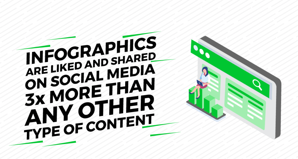
An infographic is content that can make your search engine optimization (SEO) campaign up to 95% more effective. Infographics can convey a very complex and challenging message to your readers directly. This is a very effective way to get the viewer’s attention because 85 percent of people are visual learners.
What is a High-Quality Infographic?
According to the Oxford English Dictionary, an infographic (or information graphic) is “a visual representation of information or data.” In detail, an infographic is a variety of images, graphics, and text that provide an easy-to-understand synopsis of a topic. But only a well-planned, expertly designed, and easy-to-understand infographic can be called a “high-quality” infographic.
So how do you make a high-quality infographic? And how will this high-quality infographic fit into an SEO campaign?
Types of Infographics
Do you want to choose the best infographic style that successfully conveys your information? Well, it depends on the purpose of your infographic and the type of information you hope to convey to your viewer.
Understanding the broad definition of infographics and incorporating different types of infographics into your content strategy can be your asset for SEO service.
Let’s analyze the types of infographics:
Statistical infographics: used to view search results and present data from relevant sources.
Informational infographic: visual content that expresses a new or specialized concept and provides an overview of a topic.
Process infographics: Provides a summary or overview of the steps in a process. The process infographic will allow you to simplify and clarify each step.
Timeline infographic: This content displays the history of something, highlights important dates, and provides an overview of events.
Comparison infographics: This is the best way to show the comparison of important segments of your business, price, product or idea or to list the pros and cons of each of your products.
Geographic infographics: These usually include a map and various data relevant to the map. A good option when you want to display statistics, search results, and other demographics.
Hierarchical infographics: coordinate data at predefined levels. This content usually shows how information is organized at various levels and how those levels are correlated. They are usually made up of pyramid charts.
Flowchart infographics: Usually used to show how a topic divides or grows.
List infographics: These are useful educational tools that often contain a lot of pertinent information classified in the form of text and icons. Lists make content easier to read, which makes it beneficial for an audience that wants useful information quickly.
Anatomical infographic: analyze the shape or texture of a subject, indicating how it is assembled or functions.
Visual resume: An increasingly popular style in curriculum, you can succinctly showcase your skills, goals, and experience.
Photo infographics: These are image-based and used to help visualize practical concepts or to tell a true story.
These are the most traditional types of infographics. You can use them according to your goals.
How to Create a High-Quality Infographic?
Different types of infographics are created to express different types of facts. Creating an ideal and captivating infographic depends a lot on a person’s creativity. But it is possible to create an impressive one by following a few tips.
Customize Your Infographic to Suit Your Target Audience:
An infographic is great if it satisfies the target audience. The infographics with the most traction, the most attention, and the most virality are those that meet the requirements or expectations of the target audience. When creating infographics, make sure they contain specific, relevant, and personalized content so that it delivers the right message to your target audience.
Create a Magnificent Headline:
The title of your infographic is essential. This topic is the same as the blog post. Without an attractive title, the infographic won’t be viewed.
Do’s
- Make it short enough to read at a glance
- Keep it relevant
- Create a title that catches the reader’s eye
Don’ts
- Don’t make it too wordy
- Avoid critical words, use a more natural synonym
- Don’t use irrelevant words to get attention
Keep it Simple and Focused:
The main goal of creating an infographic is to present a topic easily so that it is quickly understood by the target audience, so try to keep the infographic as simple as possible. Find, collect data and organize it in an organized way.
Keep it simple and focused on a single topic. Many people want to highlight more than one topic and make it very complicated, but that will not attract the attention of the readers. Don’t turn your infographic into a jumble of facts and charts.
Benefits of the Templates:
Models make any task more comfortable. If you are a beginner and want to create a quality infographic, all you have to do is choose your template, connect the generic images and graphics, and attach your information. This not only saves time but also helps prevent oversights. There are many tools, including free and paid options. Some of the best tools:
- Canva
- Venngage
- Piktochart
- easel.ly
- Visme
- Infogram
- Vizualize.me
- Snappa
- Animaker
- BeFunky
- Biteable
- Mind the Graph
- Show Things Visually
Show Things Visually:
If the information written in your infographic is too confusing, it won’t work and it will be considered low-quality content. You need to maintain a balance between written and visual information. An infographic should contain some quality graphics with a succinct and straightforward copy, making the content easy to navigate and the information easy to consume.
Maintain Readability:
An infographic with different font sizes is a common design practice. But a very small font will not be able to catch the reader’s attention or disturb them. However, oversized writing will appear clumsy.
This results in a loss of readability. The infographic should be easy to examine and visualize, whether the user clicks to improve it or not. Most content creators agree that 600 pixels are the correct width.
Manage Length and Size:
People naturally loathe vast and complicated content, so your infographic should be created to meet the ideals of your target audience – 8000-9000 pixels is a standard length limit that you can follow. Also, pay attention to the file size, so that even users with a slow internet connection can download your infographic. Be courteous, keep it to 1.5MB.
Final Thoughts
Creating an infographic is easy, but creating a high-quality infographic takes some effort. If you do your research thoroughly and collect your data from trusted sites and rank it well, you will catch the eye of your audience, customers, and potential customers. When done correctly, your infographic will generate more likes, followers, and subscribers, resulting in more traffic to your site.